{
    "type": "entry",
    "published": "2026-10-24T06:44:25.116554+00:00",
    "url": "https://cleverdevil.io/2026/the-ferrari-livery-for-this-weekends-gp",
    "syndication": [
        "https://cleverdevil.club/@jonathan/117494531043337378",
        "https://bsky.app/profile/cleverdevil.io/post/3mym3qs4hnt2z"
    ],
    "content": {
        "text": "The Ferrari livery for this weekend\u2019s GP looks like butt. They\u2019ve let the HP branding take over. Ferrari isn\u2019t blue and white. Get rid of it. \ud83e\udd2e",
        "html": "<p>The Ferrari livery for this weekend\u2019s GP looks like butt. They\u2019ve let the HP branding take over. Ferrari isn\u2019t blue and white. Get rid of it. \ud83e\udd2e</p>"
    },
    "author": {
        "type": "card",
        "name": "Jonathan LaCour",
        "url": "https://cleverdevil.io",
        "photo": "https://cleverdevil.io/profile/photo"
    },
    "post-type": "note",
    "_id": "49988307",
    "_source": "10"
}
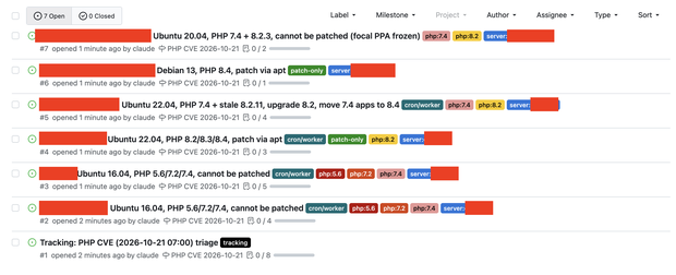
This is what deferred maintenance looks like. This is why I've been working through the backlog of my projects. I've been either using Claude to upgrade them to a modern PHP version, or archiving them as static HTML.
Claude was also able to put this report together for me in about 5 minutes. Now I just have to triage, and yes there will be some hard decisions to make.
{
    "type": "entry",
    "published": "2026-10-20T22:15:01-07:00",
    "url": "https://aaronparecki.com/2026/10/20/24/",
    "category": [
        "php",
        "security"
    ],
    "photo": [
        "https://aperture-media.p3k.io/aaronparecki.com/c202ed7ec0662cbaa62291779c8ca664ba66d2b8829ef875fb09f73303b50702.png"
    ],
    "content": {
        "text": "Massive PHP CVE drops tomorrow. \n\nThis is what deferred maintenance looks like. This is why I've been working through the backlog of my projects. I've been either using Claude to upgrade them to a modern PHP version, or archiving them as static HTML. \n\nClaude was also able to put this report together for me in about 5 minutes. Now I just have to triage, and yes there will be some hard decisions to make.",
        "html": "Massive PHP CVE drops tomorrow. <br /><br />This is what deferred maintenance looks like. This is why I've been working through the backlog of my projects. I've been either using Claude to upgrade them to a modern PHP version, or archiving them as static HTML. <br /><br />Claude was also able to put this report together for me in about 5 minutes. Now I just have to triage, and yes there will be some hard decisions to make."
    },
    "author": {
        "type": "card",
        "name": "Aaron Parecki",
        "url": "https://aaronparecki.com/",
        "photo": "https://aperture-media.p3k.io/aaronparecki.com/41061f9de825966faa22e9c42830e1d4a614a321213b4575b9488aa93f89817a.jpg"
    },
    "post-type": "photo",
    "_id": "49952104",
    "_source": "16"
}
Miami is #1 in the AP poll for the first time since 2002. My confidence level in the team’s ability to win it all is at its lowest this season, but maybe I’m being too harsh. It’s not easy to win every game that you play in a power four conference.
{
    "type": "entry",
    "published": "2026-10-18T21:23:41.697797+00:00",
    "url": "https://cleverdevil.io/2026/miami-is-1-in-the-ap-poll-for-the-first",
    "syndication": [
        "https://cleverdevil.club/@jonathan/117464014637029048",
        "https://bsky.app/profile/cleverdevil.io/post/3my6k3jz4xr2g"
    ],
    "content": {
        "text": "Miami is #1 in the AP poll for the first time since 2002. My confidence level in the team\u2019s ability to win it all is at its lowest this season, but maybe I\u2019m being too harsh. It\u2019s not easy to win every game that you play in a power four conference.",
        "html": "<p>Miami is #1 in the AP poll for the first time since 2002. My confidence level in the team\u2019s ability to win it all is at its lowest this season, but maybe I\u2019m being too harsh. It\u2019s not easy to win every game that you play in a power four conference.</p>"
    },
    "author": {
        "type": "card",
        "name": "Jonathan LaCour",
        "url": "https://cleverdevil.io",
        "photo": "https://cleverdevil.io/profile/photo"
    },
    "post-type": "note",
    "_id": "49924539",
    "_source": "10"
}
{
    "type": "entry",
    "published": "2026-10-18T04:09:02.267463+00:00",
    "url": "https://cleverdevil.io/2026/so-id-just-like-to-point-out-that-malach",
    "syndication": [
        "https://cleverdevil.club/@jonathan/117459946201771550",
        "https://bsky.app/profile/cleverdevil.io/post/3my4qbgfwsm2v"
    ],
    "content": {
        "text": "So I\u2019d just like to point out that Malachi Toney put up insane numbers today and Jeremiah Smith didn\u2019t. \ud83e\udd37",
        "html": "<p>So I\u2019d just like to point out that Malachi Toney put up insane numbers today and Jeremiah Smith didn\u2019t. \ud83e\udd37</p>"
    },
    "author": {
        "type": "card",
        "name": "Jonathan LaCour",
        "url": "https://cleverdevil.io",
        "photo": "https://cleverdevil.io/profile/photo"
    },
    "post-type": "note",
    "_id": "49916664",
    "_source": "10"
}