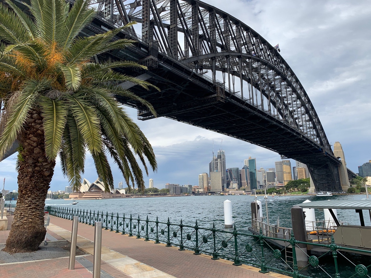
{
    "type": "entry",
    "published": "2019-09-16T08:40:55+10:00",
    "url": "https://aaronparecki.com/2019/09/16/9/sydney",
    "category": [
        "travel"
    ],
    "photo": [
        "https://aperture-media.p3k.io/aaronparecki.com/e93cb1a01b037c2e544bd54fb2cd5cb4a37492b825defb516da2d71fdae269b1.jpg"
    ],
    "syndication": [
        "https://twitter.com/aaronpk/status/1173366123057700864"
    ],
    "content": {
        "text": "Happy Monday from Sydney! It feels like Spring out here! \n\nNo time for jet lag, gotta run to meetings all day!",
        "html": "Happy Monday from Sydney! It feels like Spring out here! <br /><br />No time for jet lag, gotta run to meetings all day!"
    },
    "author": {
        "type": "card",
        "name": "Aaron Parecki",
        "url": "https://aaronparecki.com/",
        "photo": "https://aperture-media.p3k.io/aaronparecki.com/41061f9de825966faa22e9c42830e1d4a614a321213b4575b9488aa93f89817a.jpg"
    },
    "post-type": "photo",
    "_id": "5275233",
    "_source": "16"
}
{
    "type": "entry",
    "published": "2019-09-15T22:11:31+00:00",
    "url": "https://twitter.com/anomalily/status/1173358709713453056",
    "content": {
        "text": "I left autumn and ran to spring. Hello, I am in Australia. No selfie because I look like I have been on planes for 21 hours."
    },
    "author": {
        "type": "card",
        "name": "Lillian Karabaic \ud83d\udd1c \ud83c\udde6\ud83c\uddfa\ud83e\udd98\ud83d\udc28",
        "url": "https://twitter.com/anomalily",
        "photo": "https://aperture-proxy.p3k.io/1de3203470b657e685f265cbf9ee7170de351cb4/68747470733a2f2f7062732e7477696d672e636f6d2f70726f66696c655f696d616765732f313132333830323430303733313636343338352f6473485147316e5a2e6a7067"
    },
    "post-type": "note",
    "_id": "5274923",
    "_source": "2773"
}
{
    "type": "entry",
    "published": "2019-09-15T18:38:34+00:00",
    "url": "https://twitter.com/jaredcwhite/status/1173305122811596800",
    "content": {
        "text": "So a female crawdad\u2014is it OK to call it a crawmom?\n\n\ud83e\udd41\n\n.\n.\n.\nAll right, I\u2019ll admit the level of humor in that joke was pretty shrimpy."
    },
    "author": {
        "type": "card",
        "name": "JaredWhite.com",
        "url": "https://twitter.com/jaredcwhite",
        "photo": "https://aperture-proxy.p3k.io/b5acc85d6e3e37693d4c4221c1981a811f0c570e/68747470733a2f2f7062732e7477696d672e636f6d2f70726f66696c655f696d616765732f313030393830383331313632383133323335332f43396233623868362e6a7067"
    },
    "post-type": "note",
    "_id": "5273251",
    "_source": "2773"
}
Thank youuuuuuu
I still choke a bit whenever smoke comes into contact.
I also really wish people chose to inhale lung cancer on their own time and place and not in public spaces where other people are subjected to it
New York State is moving to quickly ban flavored e-cigarettes amid health concerns after a surge in vaping-related illnesses, the governor said on Sunday
nyti.ms/30fR3WB
{
    "type": "entry",
    "published": "2019-09-15T17:11:08+00:00",
    "url": "https://twitter.com/jackyalcine/status/1173283118008029184",
    "quotation-of": "https://twitter.com/nytimes/status/1173282401667178498",
    "content": {
        "text": "Thank youuuuuuu\n\nI still choke a bit whenever smoke comes into contact.\n\nI also really wish people chose to inhale lung cancer on their own time and place and not in public spaces where other people are subjected to it"
    },
    "author": {
        "type": "card",
        "name": "jackyalcine \ud83d\udd1c TwitchCon 2019",
        "url": "https://twitter.com/jackyalcine",
        "photo": "https://aperture-proxy.p3k.io/c43f53b1ec2c482f22a2793cbbf5a162fa7b934e/68747470733a2f2f7062732e7477696d672e636f6d2f70726f66696c655f696d616765732f313136383232363431393531333537373437322f43387876337a33642e6a7067"
    },
    "post-type": "note",
    "refs": {
        "https://twitter.com/nytimes/status/1173282401667178498": {
            "type": "entry",
            "published": "2019-09-15T17:08:17+00:00",
            "url": "https://twitter.com/nytimes/status/1173282401667178498",
            "content": {
                "text": "New York State is moving to quickly ban flavored e-cigarettes amid health concerns after a surge in vaping-related illnesses, the governor said on Sunday\nnyti.ms/30fR3WB",
                "html": "New York State is moving to quickly ban flavored e-cigarettes amid health concerns after a surge in vaping-related illnesses, the governor said on Sunday\n<a href=\"https://nyti.ms/30fR3WB\">nyti.ms/30fR3WB</a>"
            },
            "author": {
                "type": "card",
                "name": "The New York Times",
                "url": "https://twitter.com/nytimes",
                "photo": "https://pbs.twimg.com/profile_images/1098244578472280064/gjkVMelR.png"
            },
            "post-type": "note"
        }
    },
    "_id": "5272469",
    "_source": "2773"
}
{
"type": "entry",
"published": "2019-09-15T12:10:56+0000",
"url": "https://quickthoughts.jgregorymcverry.com/2019/09/15/finishedish-my-gallery-design-using-css-grid-indieweb",
"syndication": [
"https://twitter.com/jgmac1106/status/1173207637254639616"
],
"name": "Finished(ish) my Gallery Design using CSS Grid #IndieWeb",
"content": {
"text": "For the last few weeks I have toiled away on the layout for my photo collection pages (Actually come to think of it I have worked towards this goal since IndieWebCamp Austin last Feburary where I just piggybacked off of gRegor's work. You can see that attempt here). I have finally landed where I wanted. You can check out an example here: http://jgregorymcverry.com/oceancity2019.htmlMy Goals:Responsive Design\nHover effect to display title, date, and description\nDecent semantic HTML\nUse CSS Grid\nHow I did itDisclaimer, I am not a designer or front-end engineer. Just a person who enjoys building websites by copying and pasting random lessons I string together on the web so this reflection and my code probably contain a ton of mistakes.I started with this example. I then defined\u00a0 my grid. I bumped the minmax to 600. The minmax sets a range for your elements. This made it too big for many mobile displays. I thought it would fit and I wouldn't have to do a ton of media queries. It didn't but more on that later.body {\n\u00a0 padding: 20px;\n\u00a0 font-family: sans-serif;\n\u00a0 background: #f2f2f2;\n}\nimg {\n\u00a0 width: 100%; /* need to overwrite inline dimensions */\n\u00a0 height: auto;\n}\nh2 {\n\u00a0 margin-bottom: .5em;\n}\n.grid-container {\n\u00a0 display: grid;\n\u00a0 grid-template-columns: repeat(auto-fill, minmax(600px, 1fr));\n\u00a0 grid-gap: 1em;\n}\n\n\n/* hover styles */\n.gallery {\n\u00a0 position: relative;\n}\n\n.galleryPhoto {\n\u00a0 line-height: 0;\n\u00a0 overflow: hidden;\n}\n\n.galleryPhoto img {\n\u00a0 filter: blur(0px);\n\u00a0 transition: filter 0.3s ease-in;\n\u00a0 transform: scale(1.1);\n}I then started by adding the caption. I decided to use the figure and the figcaption elements rather than just divs. I find using these tags just helps me keep my head straignt. Makes it easier for me to see my website as a bunch of legos I can move around.I first used flex as I only displayed the photo title and the date I took the picture in one line. Quick and easy one-dimensional layout. Perfect task for flexbox. Added space-between and changed the font-size of the time element to make it smaller.Then I decided I wanted to add a bit of a summary for each photo. At first I kept the summary out of the figcaption. I added a <div> and moved the h-entry off of the figure. I then added a <p> element and used the e-content microformats property.It looked nice and all but having the text meant one more element to think about in terms of design. I would have to rethink my grid or have the text on the left of the image on dekstop and below on mobile.I really liked the hover effect so I wanted to see if I could add the summary overlayed as a figcaption on the figure element.This meant no more flexbox. Once you start designing up and down AND back and forth you need to pop over to grid. So I decided to nest a grid inside of each figure. I used explicit rows and columns. This means I said I want the title to here, the time to go here, and my paragraph here..galleryCaption {\n\u00a0 font-weight: bold;\n\u00a0 text-decoration: none;\n\u00a0 z-index: 1;\n\u00a0 position: absolute;\n\u00a0 top: 0;\n\u00a0 left: 0;\n\u00a0 opacity: 0;\n\u00a0 transition: opacity .5s;\n\u00a0 background: rgba(90,0,10,0.4);\n\u00a0 color: white;\n\u00a0 display: grid;\n\u00a0 grid-template-columns: 3fr 1f4;\n\u00a0 grid-template-rows: 2fr 3fr;\n\u00a0 width:100%;\n\u00a0 justify-content: space-between;\n}\n.galleryCaption .picTitle {\n\u00a0 grid-column: 1;\n\u00a0 grid-row: 1;\n\u00a0 font-size: 3.0vh;\n}\n\n.galleryCaption time {\n\u00a0 font-size: 2.0vh;\n\u00a0 grid-column: 2;\n\u00a0 grid-row: 1;\n\u00a0 font-weight: bold;\n\u00a0 text-decoration: none;\n\u00a0 z-index: 1;\n\u00a0 top: 0;\n\u00a0 left: 0;\n}\n.galleryCaption p {\n\u00a0 font-size: 2vmin;\n\u00a0 grid-column: 1/2;\n\u00a0 grid-row: 2;\n\u00a0 font-weight: bold;\n\u00a0 text-decoration: none;\n\u00a0 z-index: 1;\n\u00a0 top: 0;\n\u00a0 left: 0;\n}Then I returned back to my html. I dropped the <div> that carried the h-entry. This made me happy I wanted each figure to have the h-entry and carry a unique id. I did have to add a span to apply rules to the photo title so my file didn't get smaller, but still, losing a div makes me happy.<figure id=\"2\" class=\"gallery h-entry\">\n\u00a0\u00a0\u00a0 \u00a0\u00a0\u00a0 \u00a0\u00a0\u00a0 \u00a0\u00a0\u00a0 \u00a0\u00a0\u00a0 \u00a0\u00a0\u00a0 <div class=\"galleryPhoto\">\n\u00a0\u00a0\u00a0 \u00a0\u00a0\u00a0 \u00a0\u00a0\u00a0 \u00a0\u00a0\u00a0 \u00a0\u00a0\u00a0 \u00a0\u00a0\u00a0 \u00a0\u00a0\u00a0 <a href=\"#\">\n\u00a0\u00a0\u00a0 \u00a0\u00a0\u00a0 \u00a0\u00a0\u00a0 \u00a0\u00a0\u00a0 \u00a0\u00a0\u00a0 \u00a0\u00a0\u00a0 \u00a0\u00a0\u00a0 <img class=\"u-photo\" src=\"/photos/oceancity2019/fullyclothed.JPG\" alt=\"Danny and John walking by the beach\">\u00a0\u00a0\u00a0 </a>\n\u00a0\u00a0\u00a0 \u00a0\u00a0\u00a0 \u00a0\u00a0\u00a0 \u00a0\u00a0\u00a0 \u00a0\u00a0\u00a0 \u00a0\u00a0\u00a0 </div>\n\u00a0\u00a0\u00a0 \u00a0\u00a0\u00a0 \u00a0\u00a0\u00a0 \u00a0\u00a0\u00a0 \u00a0\u00a0\u00a0 \u00a0\u00a0\u00a0 <figcaption class=\"galleryCaption\" >\n\u00a0\u00a0\u00a0 \u00a0\u00a0\u00a0 \u00a0\u00a0\u00a0 \u00a0\u00a0\u00a0 \u00a0\u00a0\u00a0 \u00a0\u00a0\u00a0 <span class=\"picTitle\">Of Course Danny Jumps in Fully Clothed</span>\n\u00a0\u00a0\u00a0 \u00a0\u00a0\u00a0 \u00a0\u00a0\u00a0 \u00a0\u00a0\u00a0 \u00a0\u00a0\u00a0 \u00a0\u00a0\u00a0 <time datetime=\"2019-09-01 20:41:00\">2019-09-05</time>\n\u00a0\u00a0\u00a0 \u00a0\u00a0\u00a0 \u00a0\u00a0\u00a0 \u00a0\u00a0\u00a0 \u00a0\u00a0\u00a0 \u00a0\u00a0\u00a0 <p class=\"e-content\">It was hard keeping the kids out of the ocean. Hey does a helmet make it safer to swim in a huuricane?</p>\n\u00a0\u00a0\u00a0 \u00a0\u00a0\u00a0 \u00a0\u00a0\u00a0 \u00a0\u00a0\u00a0 \u00a0\u00a0\u00a0 \u00a0\u00a0\u00a0 </figcaption>I changed the CSS animations and hover a bit..gallery:hover .galleryCaption {\n\u00a0 opacity: 1;\n}\n\n.gallery:hover .galleryPhoto img {\n\u00a0 filter: blur(2px);\n}\n\n\n/* for touch screen devices */\n@media (hover: none) { \n\u00a0 .galleryCaption {\n\u00a0\u00a0\u00a0 opacity: 0;\n\u00a0 }\n\u00a0\n}I then switched to viewport sized typography. I love this method. Makes responsive typography so easy. Learned about the trick here. I did mess up somewhere. I shouldn't have had to add a media query for anything yet the photos looked too big on mobile devices. Again i think it started when I changed the minmax from 300 to 600. I should experiment with this.And when ever you add text getting symmetrical design gets tough. I think half of brutalism exists because people just got so angry trying to evenly layout text. This anger now gets expressed in a style meant to look broken but takes a stylesheet four times longer. Cathartic coding.@media only screen and (max-width: 768px) {\n\u00a0 .galleryPhoto img {\n\u00a0\u00a0\u00a0 width:45%;\n\u00a0 }\n\u00a0 .galleryCaption {\n\u00a0\u00a0\u00a0 width: 45%;\n\u00a0\u00a0\u00a0 max-height:275px;\n\u00a0 }\n}I just made everything 45% Why? No real reason, just kept refreshing on my phone until it looked like it fit. I use Firefox Preview on Android. Works there. Good enough for me.Why the 275px max height for the caption. Again not sure, this was just the calculated size in the mobile view of Firefox dev tools so I went with it. Only place I am using an actual pixel size.Next StepsI should be able to accomplish my goals without the media query. I need to experiment and seek out help.I think I am pretty stable in my design. I will play around with subgrid. I can't wait for that to drop everywhere. Spec is perfect for my goals and my addiction to to symmetrical design.I need to get better at optimizing my images. I am making people on low data plans or in poor bandwidth areas download the full size images.I learned a ton about scrset and how to use multiple files correctly, but I can't do that. Not a skill problem, more about time. I already have to download the images from Google photos, ftp to my server, write the HTML, and then ftp the page.If I had to add photo resizing to make two more images for every image I want to share...I will stop sharing photos from my website. Still in terms of \"greening\" my site I need to figure out a workflow.This may require a CDN and coding skills I do not have. Wish Google photos had download srcset option for every photo. I could check out a Flickr pro account. They make serving up multiple image sizes easy.Overall I feel I have exceeded my goals and I am proud of what\u00a0 I learned. The final(ish) stylesheet",
"html": "<p>For the last few weeks I have toiled away on the layout for my photo collection pages (Actually come to think of it I have worked towards this goal since IndieWebCamp Austin last Feburary where I just piggybacked off of <a href=\"https://gregorlove.com/\">gRegor's</a> work. You can see that attempt <a href=\"https://jgregorymcverry.com/css/gallery.css\">here</a>). I have finally landed where I wanted. You can check out an example here: <a href=\"http://jgregorymcverry.com/oceancity2019.html\"></a><a href=\"http://jgregorymcverry.com/oceancity2019.html\">http://jgregorymcverry.com/oceancity2019.html</a></p><p><img src=\"https://aperture-proxy.p3k.io/908c8cf5b72302c00af4bff5ba9245a4ccae5c44/68747470733a2f2f717569636b74686f75676874732e6a677265676f72796d6376657272792e636f6d2f66696c652f32346363653965643431636362623933323030633565336462656166303835392f7468756d622e676966\" alt=\"screenshot gif of img gallery in both dekstop and mobile you see the hover effect\" width=\"1024\" height=\"448\" /></p><h2>My Goals:</h2><ul><li>Responsive Design</li>\n<li>Hover effect to display title, date, and description</li>\n<li>Decent semantic HTML</li>\n<li>Use CSS Grid</li>\n</ul><h2>How I did it</h2><p>Disclaimer, I am not a designer or front-end engineer. Just a person who enjoys building websites by copying and pasting random lessons I string together on the web so this reflection and my code probably contain a ton of mistakes.</p><p>I started with <a href=\"https://webdesign.tutsplus.com/tutorials/create-a-css-grid-image-gallery-with-blur-effect-and-interaction-media-queries--cms-32287\">this example</a>. I then defined\u00a0 my grid. I bumped the minmax to 600. The minmax sets a range for your elements. This made it too big for many mobile displays. I thought it would fit and I wouldn't have to do a ton of media queries. It didn't but more on that later.</p><pre>body {<br />\u00a0 padding: 20px;<br />\u00a0 font-family: sans-serif;<br />\u00a0 background: #f2f2f2;<br />}<br />img {<br />\u00a0 width: 100%; /* need to overwrite inline dimensions */<br />\u00a0 height: auto;<br />}<br />h2 {<br />\u00a0 margin-bottom: .5em;<br />}<br />.grid-container {<br />\u00a0 display: grid;<br />\u00a0 grid-template-columns: repeat(auto-fill, minmax(600px, 1fr));<br />\u00a0 grid-gap: 1em;<br />}<br /><br /><br />/* hover styles */<br />.gallery {<br />\u00a0 position: relative;<br />}<br /><br />.galleryPhoto {<br />\u00a0 line-height: 0;<br />\u00a0 overflow: hidden;<br />}<br /><br />.galleryPhoto img {<br />\u00a0 filter: blur(0px);<br />\u00a0 transition: filter 0.3s ease-in;<br />\u00a0 transform: scale(1.1);<br />}</pre><p>I then started by adding the caption. I decided to use the figure and the figcaption elements rather than just divs. I find using these tags just helps me keep my head straignt. Makes it easier for me to see my website as a bunch of legos I can move around.</p><p>I first used flex as I only displayed the photo title and the date I took the picture in one line. Quick and easy one-dimensional layout. Perfect task for flexbox. Added space-between and changed the font-size of the time element to make it smaller.</p><p>Then I decided I wanted to add a bit of a summary for each photo. At first I kept the summary out of the figcaption. I added a <div> and moved the h-entry off of the figure. I then added a <p> element and used the e-content microformats property.</p><p>It looked nice and all but having the text meant one more element to think about in terms of design. I would have to rethink my grid or have the text on the left of the image on dekstop and below on mobile.</p><p>I really liked the hover effect so I wanted to see if I could add the summary overlayed as a figcaption on the figure element.</p><p>This meant no more flexbox. Once you start designing up and down AND back and forth you need to pop over to grid. So I decided to nest a grid inside of each figure. I used explicit rows and columns. This means I said I want the title to here, the time to go here, and my paragraph here.</p><pre>.galleryCaption {<br />\u00a0 font-weight: bold;<br />\u00a0 text-decoration: none;<br />\u00a0 z-index: 1;<br />\u00a0 position: absolute;<br />\u00a0 top: 0;<br />\u00a0 left: 0;<br />\u00a0 opacity: 0;<br />\u00a0 transition: opacity .5s;<br />\u00a0 background: rgba(90,0,10,0.4);<br />\u00a0 color: white;<br />\u00a0 display: grid;<br />\u00a0 grid-template-columns: 3fr 1f4;<br />\u00a0 grid-template-rows: 2fr 3fr;<br />\u00a0 width:100%;<br />\u00a0 justify-content: space-between;<br />}<br />.galleryCaption .picTitle {<br />\u00a0 grid-column: 1;<br />\u00a0 grid-row: 1;<br />\u00a0 font-size: 3.0vh;<br />}<br /><br />.galleryCaption time {<br />\u00a0 font-size: 2.0vh;<br />\u00a0 grid-column: 2;<br />\u00a0 grid-row: 1;<br />\u00a0 font-weight: bold;<br />\u00a0 text-decoration: none;<br />\u00a0 z-index: 1;<br />\u00a0 top: 0;<br />\u00a0 left: 0;<br />}<br />.galleryCaption p {<br />\u00a0 font-size: 2vmin;<br />\u00a0 grid-column: 1/2;<br />\u00a0 grid-row: 2;<br />\u00a0 font-weight: bold;<br />\u00a0 text-decoration: none;<br />\u00a0 z-index: 1;<br />\u00a0 top: 0;<br />\u00a0 left: 0;<br />}</pre><p>Then I returned back to my html. I dropped the <div> that carried the h-entry. This made me happy I wanted each figure to have the h-entry and carry a unique id. I did have to add a span to apply rules to the photo title so my file didn't get smaller, but still, losing a div makes me happy.</p><pre><figure id=\"2\" class=\"gallery h-entry\"><br />\u00a0\u00a0\u00a0 \u00a0\u00a0\u00a0 \u00a0\u00a0\u00a0 \u00a0\u00a0\u00a0 \u00a0\u00a0\u00a0 \u00a0\u00a0\u00a0 <div class=\"galleryPhoto\"><br />\u00a0\u00a0\u00a0 \u00a0\u00a0\u00a0 \u00a0\u00a0\u00a0 \u00a0\u00a0\u00a0 \u00a0\u00a0\u00a0 \u00a0\u00a0\u00a0 \u00a0\u00a0\u00a0 <a href=\"#\"><br />\u00a0\u00a0\u00a0 \u00a0\u00a0\u00a0 \u00a0\u00a0\u00a0 \u00a0\u00a0\u00a0 \u00a0\u00a0\u00a0 \u00a0\u00a0\u00a0 \u00a0\u00a0\u00a0 <img class=\"u-photo\" src=\"/photos/oceancity2019/fullyclothed.JPG\" alt=\"Danny and John walking by the beach\">\u00a0\u00a0\u00a0 </a><br />\u00a0\u00a0\u00a0 \u00a0\u00a0\u00a0 \u00a0\u00a0\u00a0 \u00a0\u00a0\u00a0 \u00a0\u00a0\u00a0 \u00a0\u00a0\u00a0 </div><br />\u00a0\u00a0\u00a0 \u00a0\u00a0\u00a0 \u00a0\u00a0\u00a0 \u00a0\u00a0\u00a0 \u00a0\u00a0\u00a0 \u00a0\u00a0\u00a0 <figcaption class=\"galleryCaption\" ><br />\u00a0\u00a0\u00a0 \u00a0\u00a0\u00a0 \u00a0\u00a0\u00a0 \u00a0\u00a0\u00a0 \u00a0\u00a0\u00a0 \u00a0\u00a0\u00a0 <span class=\"picTitle\">Of Course Danny Jumps in Fully Clothed</span><br />\u00a0\u00a0\u00a0 \u00a0\u00a0\u00a0 \u00a0\u00a0\u00a0 \u00a0\u00a0\u00a0 \u00a0\u00a0\u00a0 \u00a0\u00a0\u00a0 <time datetime=\"2019-09-01 20:41:00\">2019-09-05</time><br />\u00a0\u00a0\u00a0 \u00a0\u00a0\u00a0 \u00a0\u00a0\u00a0 \u00a0\u00a0\u00a0 \u00a0\u00a0\u00a0 \u00a0\u00a0\u00a0 <p class=\"e-content\">It was hard keeping the kids out of the ocean. Hey does a helmet make it safer to swim in a huuricane?</p><br />\u00a0\u00a0\u00a0 \u00a0\u00a0\u00a0 \u00a0\u00a0\u00a0 \u00a0\u00a0\u00a0 \u00a0\u00a0\u00a0 \u00a0\u00a0\u00a0 </figcaption></pre><p>I changed the CSS animations and hover a bit.</p><pre>.gallery:hover .galleryCaption {<br />\u00a0 opacity: 1;<br />}<br /><br />.gallery:hover .galleryPhoto img {<br />\u00a0 filter: blur(2px);<br />}<br /><br /><br />/* for touch screen devices */<br />@media (hover: none) { <br />\u00a0 .galleryCaption {<br />\u00a0\u00a0\u00a0 opacity: 0;<br />\u00a0 }<br />\u00a0<br />}</pre><p>I then switched to viewport sized typography. I love this method. Makes responsive typography so easy. Learned about the trick <a href=\"https://css-tricks.com/viewport-sized-typography/\">here</a>. </p><p>I did mess up somewhere. I shouldn't have had to add a media query for anything yet the photos looked too big on mobile devices. Again i think it started when I changed the minmax from 300 to 600. I should experiment with this.</p><p>And when ever you add text getting symmetrical design gets tough. I think half of brutalism exists because people just got so angry trying to evenly layout text. This anger now gets expressed in a style meant to look broken but takes a stylesheet four times longer. Cathartic coding.</p><pre>@media only screen and (max-width: 768px) {<br />\u00a0 .galleryPhoto img {<br />\u00a0\u00a0\u00a0 width:45%;<br />\u00a0 }<br />\u00a0 .galleryCaption {<br />\u00a0\u00a0\u00a0 width: 45%;<br />\u00a0\u00a0\u00a0 max-height:275px;<br />\u00a0 }<br />}</pre><p>I just made everything 45% Why? No real reason, just kept refreshing on my phone until it looked like it fit. I use Firefox Preview on Android. Works there. Good enough for me.</p><p>Why the 275px max height for the caption. Again not sure, this was just the calculated size in the mobile view of Firefox dev tools so I went with it. Only place I am using an actual pixel size.</p><h2>Next Steps</h2><p>I should be able to accomplish my goals without the media query. I need to experiment and seek out help.</p><p>I think I am pretty stable in my design. I will play around with <a href=\"https://www.smashingmagazine.com/2018/07/css-grid-2/\">subgrid</a>. I can't wait for that to drop everywhere. Spec is perfect for my goals and my addiction to to symmetrical design.</p><p>I need to get better at optimizing my images. I am making people on low data plans or in poor bandwidth areas download the full size images.</p><p>I learned a ton about <a href=\"https://developer.mozilla.org/en-US/docs/Learn/HTML/Multimedia_and_embedding/Responsive_images\">scrset</a> and how to use multiple files correctly, but I can't do that. Not a skill problem, more about time. I already have to download the images from Google photos, ftp to my server, write the HTML, and then ftp the page.</p><p>If I had to add photo resizing to make two more images for every image I want to share...I will stop sharing photos from my website. Still in terms of \"greening\" my site I need to figure out a workflow.</p><p>This may require a CDN and coding skills I do not have. Wish Google photos had download srcset option for every photo. I could check out a Flickr pro account. They make serving up multiple image sizes easy.</p><p>Overall I feel I have exceeded my goals and I am proud of what\u00a0 I learned. <a href=\"https://jgregorymcverry.com/css/gallery2.css\">The final(ish) stylesheet</a></p>"
},
"author": {
"type": "card",
"name": "Greg McVerry",
"url": "https://quickthoughts.jgregorymcverry.com/profile/jgmac1106",
"photo": "https://aperture-proxy.p3k.io/caeb995d615fbe49086b65db17f0eae5d43ef188/68747470733a2f2f717569636b74686f75676874732e6a677265676f72796d6376657272792e636f6d2f66696c652f32643663396366656437616338653834396634393262356263376536613633302f7468756d622e6a7067"
},
"post-type": "article",
"_id": "5271738",
"_source": "1300"
}